Imagine looking at two advertisements for the same product.
One immediately grabs your attention. You understand the message within seconds, remember the brand, and even feel tempted to buy.
The other looks cluttered, confusing, and forgettable.
Both use the same software.
Both use the same colors.
Both have similar images.
So what makes one design successful while the other fails?
The answer lies in graphic design principles.
These principles are the invisible rules behind every effective design. Whether you're creating a logo, website, social media post, packaging, or presentation, understanding these principles will help you communicate more clearly and design with confidence.
In this guide, you'll learn the most important graphic design principles, why they matter, and how professional designers apply them in real projects.
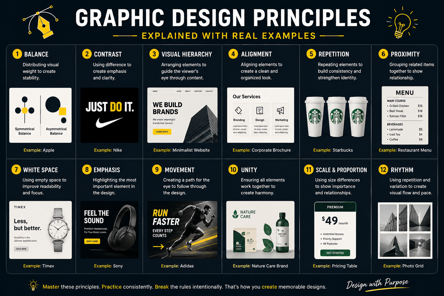
What Are Graphic Design Principles?
Graphic design principles are the guidelines that determine how visual elements work together. They help designers organize information, create visual harmony, direct attention, and improve communication.
Think of design elements (such as color, typography, images, and shapes) as the ingredients. Design principles are the recipe that turns those ingredients into something meaningful.
Without principles, even the most beautiful visuals can feel disorganized or confusing.
Why Are Graphic Design Principles Important?
Design principles help you:
- Communicate ideas clearly.
- Improve user experience.
- Create visually appealing layouts.
- Build trust in a brand.
- Guide the viewer's attention.
- Make information easier to understand.
- Increase engagement and conversions.
Good design isn't accidental; it's intentional.
1. Balance
What Is Balance?
Balance is the distribution of visual weight throughout a design. It prevents layouts from feeling unstable or uncomfortable.
There are three common types of balance:
- Symmetrical Balance
- Asymmetrical Balance
- Radial Balance
Real Example
Imagine a luxury law firm's website.
The logo is centered, navigation is evenly spaced, and the hero image aligns perfectly with the headline. Everything feels formal, stable, and trustworthy because symmetrical balance is used.
On the other hand, a modern creative agency might place a large image on one side and bold typography on the other. Although the layout isn't mirrored, it still feels balanced because visual weight is distributed thoughtfully.
Best Practice
Ask yourself:
Does one side of the design feel heavier than the other?
If yes, adjust spacing, image size, or typography until the composition feels balanced.
2. Contrast
What Is Contrast?
Contrast is the difference between visual elements. It helps important information stand out.
Contrast can be created using:
- Color
- Size
- Shape
- Typography
- Texture
- Space
Real Example
A "Buy Now" button on an e-commerce website is often bright against a neutral background. This makes it the first thing users notice.
Without sufficient contrast, important actions can easily be overlooked.
Best Practice
Use contrast to emphasize what matters most, but avoid making every element compete for attention.
3. Visual Hierarchy
What Is Visual Hierarchy?
Visual hierarchy determines the order in which people notice information.
Since users scan rather than read, your layout should naturally guide their eyes.
Real Example
A landing page might follow this sequence:
- Large headline
- Supporting description
- Product image
- Customer testimonials
- Call-to-action button
The viewer instantly knows where to look first.
Best Practice
Control hierarchy through:
- Size
- Weight
- Color
- Placement
- Contrast
- Spacing
4. Alignment
What Is Alignment?
Alignment creates order by ensuring elements relate to one another.
Nothing should appear randomly placed.
Real Example
A resume where every heading, paragraph, and icon aligns to the same grid feels organized and professional.
Misaligned elements create unnecessary visual noise.
Best Practice
Use grids and guides instead of relying on visual estimation.
5. Repetition
What Is Repetition?
Repetition creates consistency by reusing visual elements throughout a design.
These include:
- Fonts
- Colors
- Buttons
- Icons
- Layouts
- Patterns
Real Example
A company's website uses the same blue buttons, heading style, and icon design across every page. Visitors immediately recognize the brand.
Consistency strengthens recognition.
Best Practice
Create reusable design systems instead of redesigning every component.
6. Proximity
What Is Proximity?
Related information should be grouped.
Unrelated information should be separated.
Real Example
On a restaurant menu:
- The dish name, description, and price are grouped.
- Different categories have generous spacing between them.
Customers quickly understand the menu structure.
Best Practice
Spacing often communicates relationships better than borders or lines.
7. White Space
What Is White Space?
White space (also called negative space) refers to the empty areas around design elements.
It improves readability and allows important content to breathe.
Real Example
Premium brands often leave generous margins around headlines and product photos. This creates a clean, elegant appearance.
Crowded designs can feel overwhelming, even when all the information is useful.
Best Practice
Don't treat
space as wasted space. It's an active design tool.
8. Emphasis
What Is Emphasis?
Emphasis highlights the most important element in a design.
Every composition should have a clear focal point.
Real Example
A movie poster may feature the lead actor's face prominently while the title and release date are secondary. Your eyes know exactly where to look first.
Best Practice
If everything is emphasized, nothing is emphasized. Limit yourself to one primary focal point.
9. Movement
What Is Movement?
Movement is the visual path a viewer's eye follows.
Designers guide this path intentionally.
Real Example
A landing page might lead the eye from:
Headline → Product Image → Benefits → Testimonials → Call-to-Action
Each section encourages the next interaction.
Best Practice
Use directional shapes, leading lines, spacing, and hierarchy to create a natural reading flow.
10. Unity
What Is Unity?
Unity ensures every element feels like it belongs to the same design.
Without unity, layouts appear inconsistent or chaotic.
Real Example
Imagine a brand using:
- Minimal icons
- Elegant typography
- Soft color palette
- Rounded buttons
If one page suddenly introduces neon colors and playful fonts, the overall experience becomes inconsistent.
Best Practice
Develop a visual language and apply it consistently across all touchpoints.
11. Scale and Proportion
What Are Scale and Proportion?
Scale refers to the size of elements relative to each other.
Proportion ensures these size relationships feel intentional.
Real Example
A homepage headline is significantly larger than body text because it's more important.
This creates a clear reading order and improves usability.
Best Practice
Use size differences to establish importance rather than making everything similar in scale.
12. Rhythm
What Is Rhythm?
Rhythm is created through repeated patterns, spacing, colors, or shapes that establish a sense of flow.
Real Example
A social media carousel uses consistent margins, recurring icon styles, and repeating layouts across each slide. This makes the content feel cohesive and easier to follow.
Best Practice
Repetition combined with variation creates engaging visual rhythm without becoming monotonous.
How AI Has Changed Graphic Design Principles
AI tools can generate layouts, color palettes, illustrations, and marketing assets within seconds.
However, AI doesn't eliminate the need for design principles.
A generated design can still suffer from:
- Poor hierarchy
- Weak contrast
- Inconsistent spacing
- Misaligned elements
- Confusing composition
Professional designers stand out because they evaluate, refine, and improve AI-generated outputs using these timeless principles.
Think of AI as a fast assistant—not a substitute for design judgment.
Common Mistakes Beginners Make
Avoid these common errors:
- Using too many fonts.
- Ignoring white space.
- Making every element equally important.
- Choosing colors without purpose.
- Overusing design trends.
- Placing elements without alignment.
- Inconsistent spacing.
- Weak typography hierarchy.
- Designing for yourself instead of the audience.
- Relying entirely on AI without reviewing the result.
Recognizing these mistakes early will accelerate your growth as a designer.
How to Practice Graphic Design Principles
You don't need expensive projects to improve.
Try these exercises:
- Recreate advertisements from major brands.
- Redesign an existing website homepage.
- Analyze magazine covers and identify the principles being used.
- Create multiple versions of the same poster with different layouts.
- Study logos and identify how balance, proportion, and simplicity work together.
- Review AI-generated designs and improve them using better hierarchy, spacing, and typography.
The goal isn't to copy—it's to understand the thinking behind effective design.
Frequently Asked Questions
What are the main graphic design principles?
The most widely used principles are balance, contrast, hierarchy, alignment, repetition, proximity, white space, emphasis, movement, unity, scale, proportion, and rhythm.
Why are graphic design principles important?
They help organize information, improve readability, create visually appealing compositions, and communicate messages more effectively.
Can AI replace knowledge of design principles?
No. AI can generate ideas and layouts, but understanding design principles allows you to evaluate, refine, and adapt those outputs to real communication goals.
Which graphic design principle is the most important?
There isn't a single most important principle. Effective design usually combines several principles, such as hierarchy, contrast, alignment, and white space, to achieve the desired outcome.
How long does it take to learn graphic design principles?
You can understand the fundamentals in a few weeks, but mastering them comes through continuous practice, feedback, and applying them to real projects.
Final Thoughts
Graphic design principles are the foundation of every successful visual experience. While software, trends, and AI tools continue to evolve, these principles remain constant because they are rooted in how people perceive and process information.
The best designers don't simply create attractive layouts—they create experiences that are easy to understand, memorable, and effective. Whether you're designing a brand identity, a website, a mobile app, or a social media campaign, applying principles like balance, contrast, hierarchy, and unity will help your work communicate with greater clarity and purpose.
As AI becomes an increasingly powerful part of the creative process, your competitive advantage won't come from generating more designs. It will come from knowing why one design works better than another. Master these principles, and you'll be able to improve both your own ideas and AI-generated concepts with confidence.
Comments 0
Join the Conversation